Visually identifying the future of humanising practice
From the early stages of Humanise’s development, I was building visuals for the company’s website. Embracing their message of ‘revolutionising learning,’ I worked on ways that I could incorporate their human-centred focus into my designs.
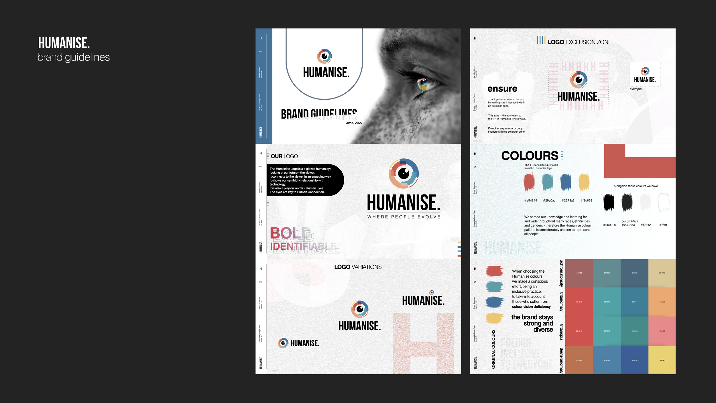
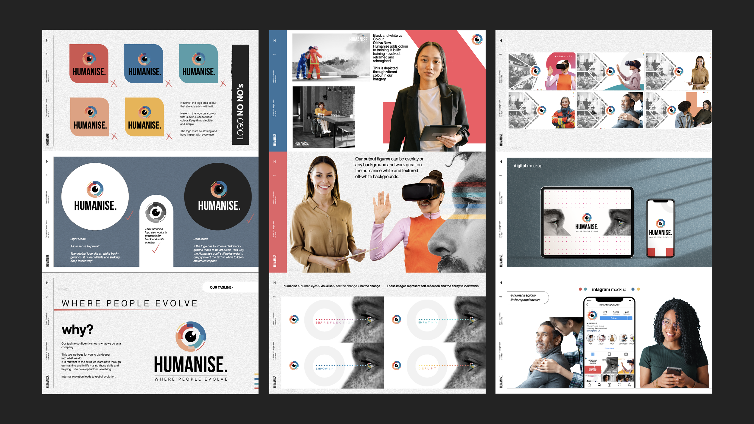
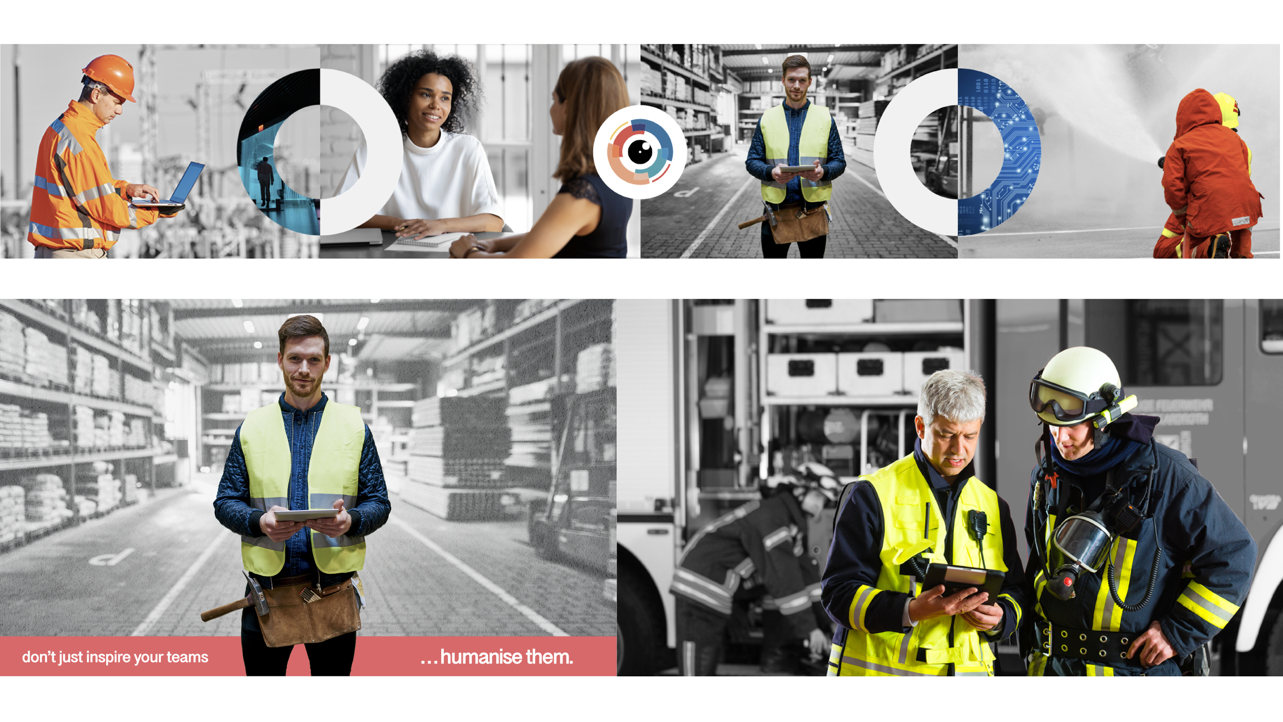
This process started with experimenting with their name ‘Humanise’ and finding ways to visually tell their brand story. I crafted a logo that drew inspiration from a ‘human eye’ and continued its connotations of empathy and connection in all of the brand’s collateral.
Perhaps the most notable way I achieved this was through the use of primary colours. I made these strikingly apparent across all of the web pages to reflect the multifaceted sense of inclusion that Humanise was designed to achieve. By refusing to stick to one colour, I could visually demonstrate diversity in the design itself.
My vision was met with praise by Humanise’s directors and key shareholders alike. Consequently, it was extended across their training booklets and online marketing as well.